Restaurant Menu Design: Choosing What You Order Before You Order It
You think you’re choosing your dinner. Most of the time, the menu already chose for you.
Before a single word is read closely, your eye has already been guided toward one dish — through placement, price anchoring, box borders, and the gap of white space around it. Restaurant menu design is one of the purest forms of persuasive writing and layout working together, and almost nobody reading a menu realizes they’re being directed at all.
What Is Menu Design, Really? (Quick Answer)
Restaurant menu design is the deliberate use of layout, pricing, language, and visual hierarchy to guide a diner toward specific dishes — usually the highest-margin ones — before the diner consciously evaluates the full menu. Techniques include price anchoring, strategic placement (top-right and center boxes draw the eye first), limited descriptive language, and controlled white space around “hero” items.
The Menu Is a Headline, Repeated Twenty Times
Every dish name on a menu is doing the same job a headline does: making a promise in the fewest possible words. “Grilled Salmon” is a label. “Charred Norwegian Salmon, Citrus Butter, Crisp Skin” is a promise — specific enough to make you taste it before it arrives. The difference in word count is tiny. The difference in orders is not.
Where Your Eye Goes First (And Why)
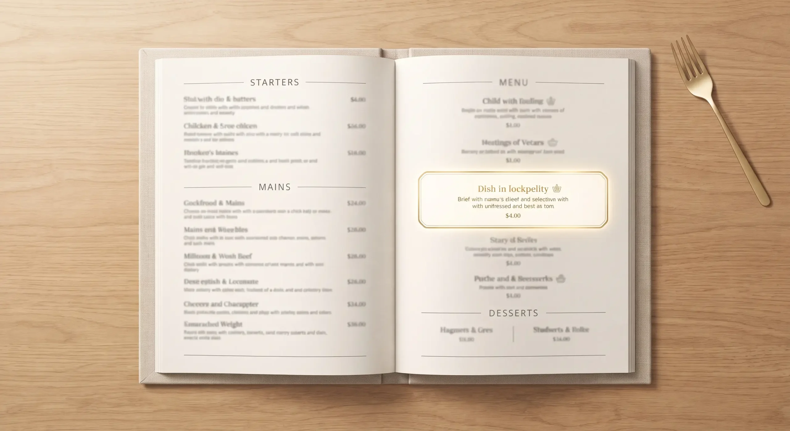
Eye-tracking studies on menus consistently show the same pattern: diners scan in a loose Z or golden-triangle shape, landing first on the top-right of a page, then the center, then down. Restaurants that understand this don’t place their cheapest dish there — they place their most profitable one, often boxed, bordered, or given extra white space to isolate it from the surrounding clutter.
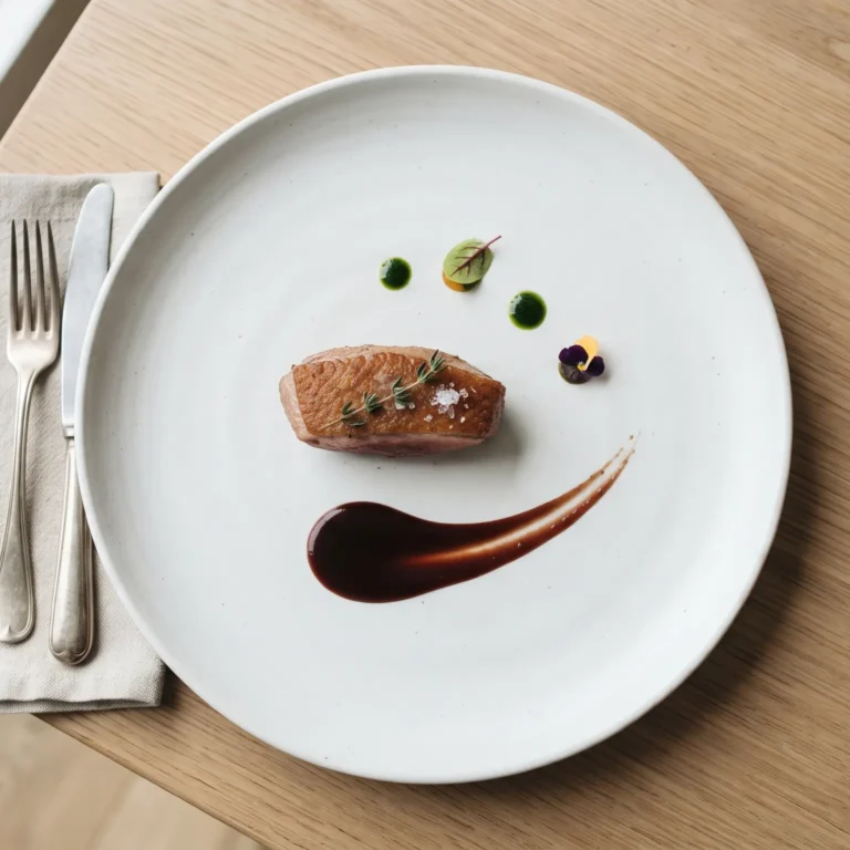
This is the same principle behind white space in writing: space isn’t empty, it’s emphasis. A dish surrounded by breathing room reads as more important — and more expensive-feeling — than one crammed between six other entrees in dense type.
Price Anchoring: The Decoy That Makes You Order “Well”
Most menus include at least one deliberately overpriced dish near the top of a section — not because the restaurant expects to sell many of it, but because it resets your sense of “normal” price. Once your brain has registered a $68 steak, a $34 entree below it feels reasonable, even generous. This is a pricing version of negotiation psychology: the first number anchors everything that follows, regardless of whether it was ever meant to be chosen.
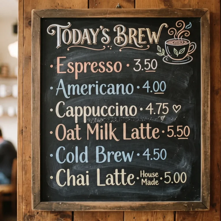
Menus also routinely drop currency symbols (“28” instead of “$28”) because the dollar sign triggers a subtle mental association with spending and loss, measurably reducing the amount diners are willing to order.
Descriptive Language Is Editing by Addition — But Only a Little
Most writing advice says editing is subtraction — cut until only the essential remains. Menu copy inverts that principle slightly: a few carefully chosen adjectives (“slow-roasted,” “stone-ground,” “hand-pulled”) increase perceived value and taste expectation, while too many become noise that readers skip entirely. The skill isn’t writing more — it’s writing exactly enough sensory detail to trigger imagination, then stopping before it reads like a sales pitch.
Every Menu Needs a Voice, Not Just a Layout
A menu that lists “Burger — $14” everywhere feels interchangeable with every other menu in the city. A menu that describes “Our Burger — $14, the one regulars order twice in one sitting” has a voice — the same way a writer builds a byline people recognize through consistent tone across every piece they write. Menu voice should match the way the restaurant actually talks to guests at the table — casual, formal, playful — because inconsistency between the menu’s tone and the server’s tone breaks trust before the food even arrives.
The Menu Is the Restaurant’s Business Card
A diner forms an impression of a restaurant from its menu in roughly the same way they form an impression of a company from a business card — paper stock, font choice, and layout all communicate quality before a single dish is tasted. A laminated, clip-art-heavy menu signals something very different than one printed on heavy matte stock with restrained typography, even if the kitchen behind both is equally skilled.
Reading the Menu Is Reading the Room
A good menu also adjusts to the moment the way a server or host reads the room before making recommendations — a lunch menu needs faster scanning and clearer price points than a tasting menu meant to be lingered over. Fine-dining menus often remove prices entirely from tasting formats, shifting the diner’s focus from “what does this cost” to “what does this experience feel like” — a deliberate design choice, not an oversight.
Menus as a Form of Onboarding
For a first-time guest, the menu functions as a blog’s opening sentence functions for a reader — it has to earn the next five seconds of attention or the guest defaults to the familiar dish they always order. A menu’s first section (often appetizers or “starters to share”) is frequently the restaurant’s best chance to introduce its voice and style before the diner’s guard relaxes into familiar ordering habits.
Designing With Dignity, Not Just Profit
The best menus balance persuasion with respect for the guest — not every design choice should exist purely to extract a higher check. This is where dignity as a design principle matters: a menu that clearly marks allergens, lists prices honestly, and doesn’t bury the “value” options in tiny unreadable type is treating the diner as a person making an informed choice, not a mark to be steered. Manipulative design (hiding the cheapest dish, vague “market price” tactics that obscure real cost) erodes trust even when it briefly increases spend.
A Menu Is Also a Newsletter You Read Once a Visit
The best menu copy reads the way a good newsletter reads — like a person talking to you, not a brochure describing a product. “We’ve been making this sauce the same way since 1987” lands very differently than “Signature House Sauce.” Conversational menu copy builds the same kind of familiarity a well-written newsletter builds issue after issue — except a menu only gets one shot per visit to make that impression.
Common Menu Design Mistakes (And the Fix)
| Mistake | Why It Fails | Fix |
|---|---|---|
| Listing dishes by price, low to high | Trains diners to scan for cheapest option first | Group by category, not price order |
| Using dollar signs everywhere | Triggers subtle spending aversion | Drop currency symbols, use plain numbers |
| Overwriting every dish description | Descriptions blur together, lose impact | Reserve rich language for 2–3 hero dishes per section |
| No visual hierarchy or boxes | Every dish competes equally, nothing stands out | Use white space and borders to highlight 1 dish per section |
| Mismatched tone (formal menu, casual staff) | Breaks guest trust before the meal starts | Align menu voice with how staff actually speak |
Frequently Asked Questions
Why do restaurants put certain dishes in boxes on the menu?
Boxing or bordering a dish isolates it visually, drawing the eye to it first and signaling it as a recommended or high-margin item — a deliberate design choice, not decoration.
Why don’t high-end menus show prices?
Removing prices shifts attention from cost to experience, which is especially common on tasting menus where the goal is to make the diner focus on the meal’s narrative rather than comparison-shopping between dishes.
Does removing the dollar sign really change what people order?
Yes — studies on menu psychology consistently show diners spend more when currency symbols are dropped, because the symbol creates a subtle mental association with loss.
What makes menu descriptions effective?
A small number of specific, sensory words (texture, origin, preparation method) rather than a long list of adjectives — enough detail to trigger imagination without reading like a sales pitch.
Is menu design manipulative?
It can be, but it doesn’t have to be. Designing with clear pricing, honest descriptions, and visible allergen information respects the guest while still guiding attention — persuasion and honesty aren’t mutually exclusive.