Coffee Shop Chalkboard: Handwriting as Brand Voice
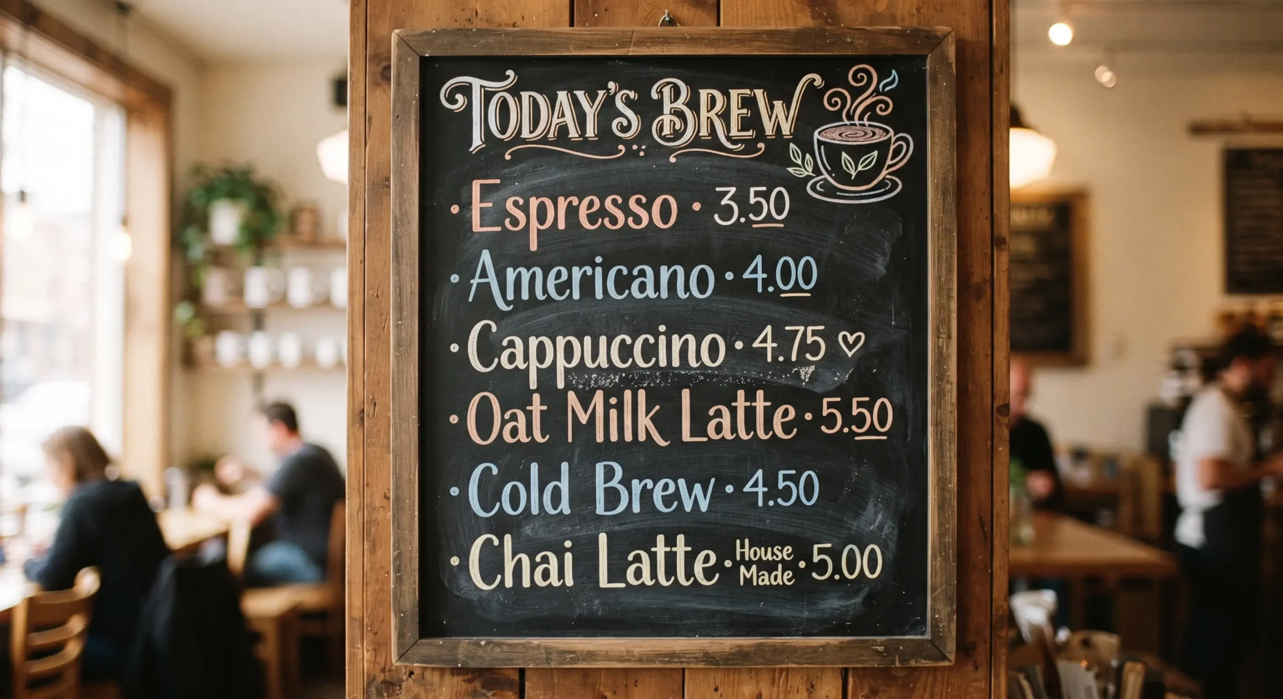
Walk past two coffee shops. One has a printed menu board — vector font, perfectly kerned, backlit. The other has a chalkboard with slightly uneven letters, a coffee cup doodled in the corner, today’s special underlined twice. You will trust the second one more before you’ve tasted either coffee.
That’s not an accident of taste. It’s brand voice doing its job through a medium most people don’t think to examine: handwriting.
Why Does Chalkboard Handwriting Build Trust? (Quick Answer)
Handwritten chalkboard menus signal that a human — not a template — is actively running the shop today. The slight imperfections in hand lettering function as proof of presence: someone wrote this this morning, which implies the coffee was also made fresh this morning. Print removes that signal entirely, which is why handwritten menus consistently read as warmer and more trustworthy, even when the coffee quality is identical.
Handwriting Is a Visual Byline
Every café has a voice, whether it chooses one deliberately or not. A byline builds a voice people recognize in writing — a consistent way of phrasing things that readers learn to associate with a person. Chalkboard handwriting does the same job visually. The same slightly-slanted capital letters, the same way “oat milk” gets abbreviated, the same doodled steam above the coffee cup icon — repeated daily, these become as recognizable as a signature. Regulars don’t just recognize the coffee. They recognize the hand that wrote the board.
The First Sentence a Customer Reads
A chalkboard’s top line works exactly like the first sentence of a blog post — it has to earn the second line. Customers scanning a board from the counter line give it about two seconds. If the top item doesn’t catch interest (“Today’s roast: Ethiopian, tastes like stone fruit”), nothing below it gets read either. The handwriting has to be legible enough to not slow that first scan down, but expressive enough to make it worth starting.
Six Words or Less: The Chalkboard Headline
The same discipline that makes a headline a promise in six words applies directly to chalkboard specials. “Pumpkin Spice Oat Latte — Back By Demand” works. A paragraph explaining the sourcing story of the cinnamon does not — not because the story isn’t interesting, but because a chalkboard is read standing up, mid-queue, with someone’s elbow in your back. Compression is the format’s whole constraint.
Editing a Chalkboard Is Still Editing
Most café owners write their board by adding — today’s special, a new seasonal drink, a reminder about the loyalty app — until the board is crowded edge to edge. But good editing is subtraction, not addition. The best chalkboards earn their charm by what they leave off: no more than three items emphasized, generous space between lines, and restraint about decorative flourishes. A board with six items shouting equally loud says nothing. A board with one item in large letters and two in small says exactly what matters today.
White Space on a Chalkboard
The empty chalk-dust-gray space between items is doing real work — the same work white space does in writing. It gives the eye somewhere to rest between the espresso list and the pastry list. A board crammed corner to corner with no breathing room reads as anxious, even if the handwriting itself is beautiful. Space is part of the message.
Reading the Line Before You Write the Board
A good barista writes the day’s board the way a good negotiator reads a room before discussing numbers — reading the room before the numbers applies here almost literally. Is it a slow Tuesday morning, or a weekend rush? Is today’s special going to sell out by 10am? The board isn’t static signage — it’s a daily decision about what story the shop needs to tell today, adjusted to the room it’s about to serve.
Writing Like You’re Talking
The best chalkboard copy reads the way a good newsletter reads — like a person talking to you, not a brand broadcasting at you. “We ran out of oat milk, sorry, almond’s great today too” builds more goodwill than a sterile “Oat milk currently unavailable.” Handwriting already signals informality; the words on it should match that tone, not undercut it with corporate phrasing.
From Chalkboard to Menu: A Consistent Brand System
A chalkboard rarely works in isolation. It needs to feel like it belongs to the same brand as the printed menu customers hold at the table, and the business card they take home. The connective tissue is usually a consistent hand — the same illustrator’s lettering style, the same icon system, the same restraint — so that walking from the counter board to the printed menu to the card in your wallet feels like one continuous voice, not three disconnected design decisions.
Presentation Beyond the Board
The chalkboard sets an expectation the rest of the experience has to honor. Just as food plating is painting with ingredients, and a tasting menu tells a story across courses, a chalkboard is the opening scene of a story the coffee and the room need to finish. A handwritten board promising “a slow morning” that’s followed by a rushed, impersonal counter experience breaks the promise the lettering made before a single word was spoken.
What Makes Chalkboard Lettering Work (And What Ruins It)
| Element | Works | Fails |
|---|---|---|
| Letter style | Slightly imperfect, consistent hand | Overly polished, stencil-perfect lettering |
| Item count | 3–5 items max, clear hierarchy | 8+ items, all the same size |
| Icons/doodles | One or two, simple, hand-drawn | Clip-art style graphics |
| Tone of copy | Conversational, like a person talking | Formal, brand-speak |
| Spacing | Generous gaps between sections | Crammed edge to edge |
| Update frequency | Visibly refreshed daily or weekly | Same board for months, dust visible |
Frequently Asked Questions
Why do handwritten chalkboard menus feel more trustworthy than printed ones?
Handwriting signals active human presence — someone wrote this recently, which implies the shop and its coffee are being tended to daily, not run on autopilot.
How many items should a coffee shop chalkboard list?
Three to five, with clear visual hierarchy. More than that and no single item stands out, which defeats the purpose of a chalkboard over a full printed menu.
Should chalkboard handwriting be neat or imperfect?
Slightly imperfect but legible and consistent. Perfectly uniform lettering (often achieved with stencils) removes the human signal that makes chalkboards work in the first place.
Does chalkboard style need to match the shop’s printed materials?
Yes. The lettering style, tone, and icon system should feel continuous across the chalkboard, printed menu, and other brand touchpoints like business cards, so customers experience one consistent voice.
How often should a chalkboard be updated?
At minimum weekly, ideally daily for specials. A visibly static or dusty board undercuts the “freshness” signal handwriting is meant to create.