Food Plating: Painting With Ingredients
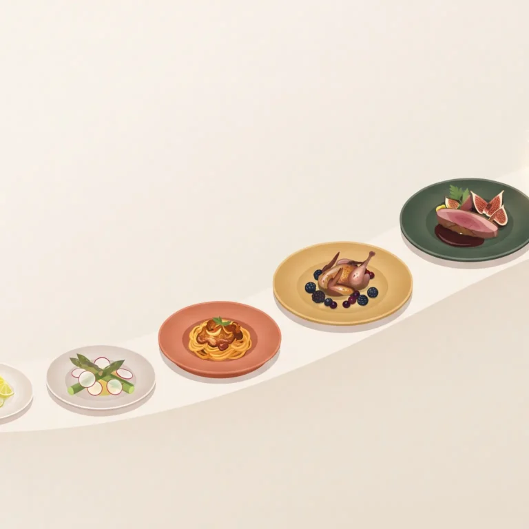
A plate of food is read before it’s tasted. The eye moves across it the way it moves across a painting — scanning for balance, color, and focal point — and forms a verdict long before the fork arrives. This is why food plating isn’t garnish. It’s composition. A chef arranging a dish is making the same decisions a painter makes with a canvas: what goes in the center, what gets left out, and how much empty space the piece can hold.
What Is Food Plating, Really? (Quick Answer)
Food plating is the deliberate visual arrangement of a dish to guide the eye, signal quality, and create anticipation before the meal is eaten. It uses the same principles as visual design — focal point, negative space, color balance, and restraint — applied to ingredients instead of ink or pixels. A well-plated dish communicates care and confidence; a cluttered one undermines even excellent cooking.
Why Plating Is a Design Problem, Not a Garnish Problem
Chefs who plate well aren’t decorating food. They’re solving the same problem a designer solves on a menu or a business card: how do you make something feel considered within a tiny, fixed space? A business card carries a whole brand in your palm — a plate carries a whole kitchen’s philosophy in a ten-inch circle. Every inch either earns its place or distracts from what matters.
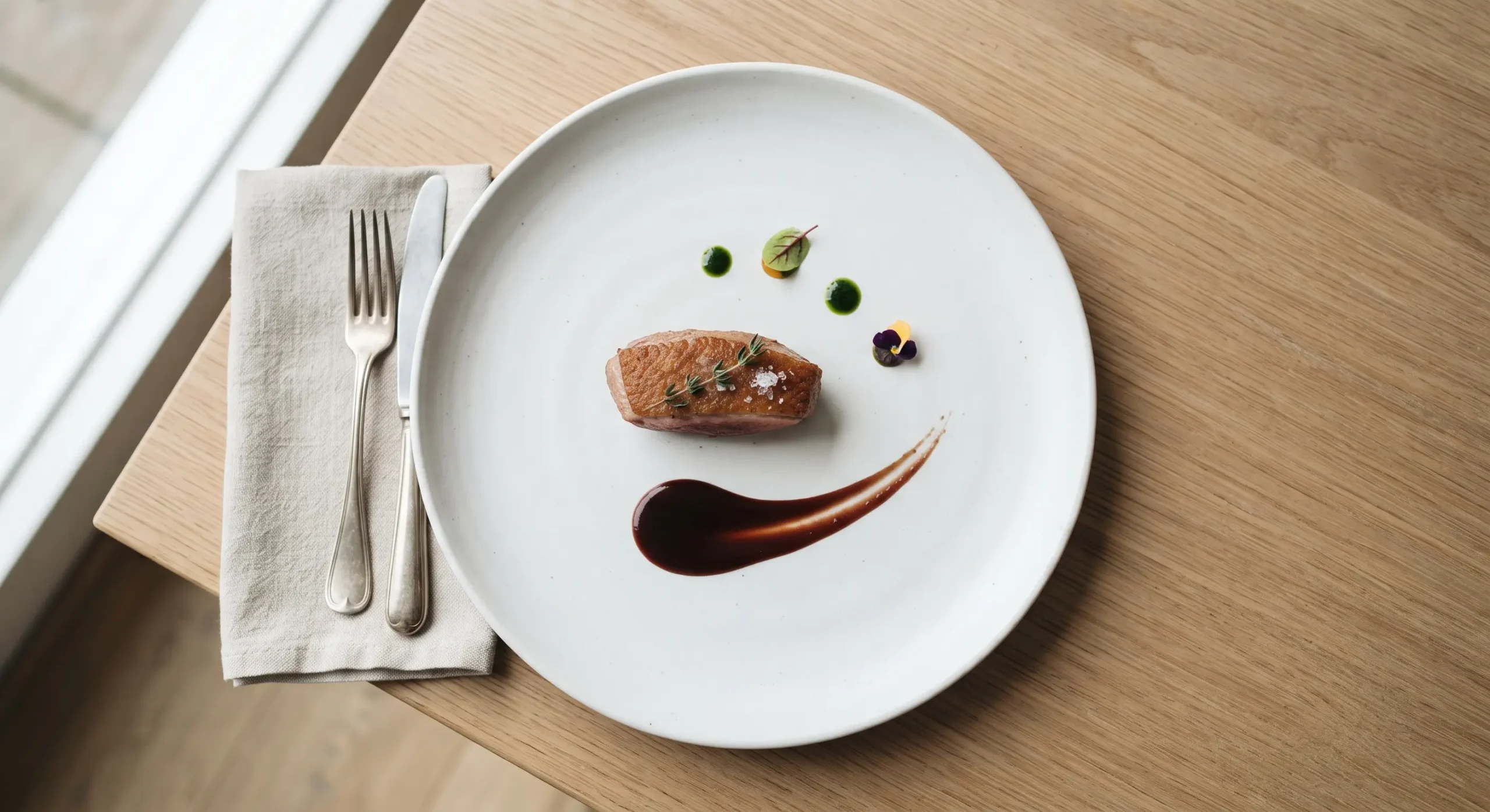
White Space on a Plate Works Like White Space on a Page
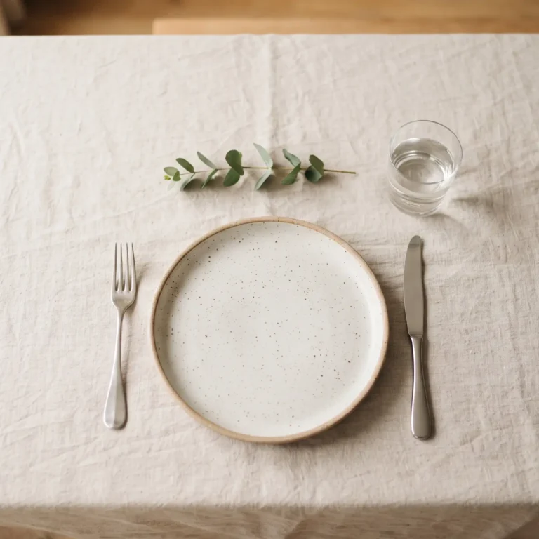
The most common plating mistake is the same mistake most beginner writers make: filling every available space because empty space feels like absence. But white space in writing isn’t empty — it’s where the eye rests and the important thing gets room to matter. A plate with visible rim, with sauce pulled into a single deliberate swipe rather than pooled everywhere, reads as confident. A plate packed edge to edge reads as anxious, regardless of how good the food tastes.
The Focal Point: Every Plate Needs One Promise
A strong headline makes a promise in six words — it tells the reader exactly what they’re about to get, before they commit to reading further. A plate works the same way. The protein, the centerpiece, the tallest element — whatever it is, it needs to be identifiable in under a second, the same way a headline needs to land before someone decides to keep reading. A plate with three competing focal points leaves the eye (and the appetite) with nowhere to settle.
Editing a Plate the Way You’d Edit a Paragraph
The best plating decisions are usually subtractive. Editing an article is an act of subtraction — the strongest drafts are the ones where something was cut, not where something was added. The same is true on a plate: the dish that reads as “composed” usually started with more elements and had several removed. A garnish that doesn’t serve the flavor or the composition is the plating equivalent of a sentence that doesn’t serve the paragraph — it has to go, however nice it looks in isolation.
Menus Set the Expectation Plating Has to Deliver
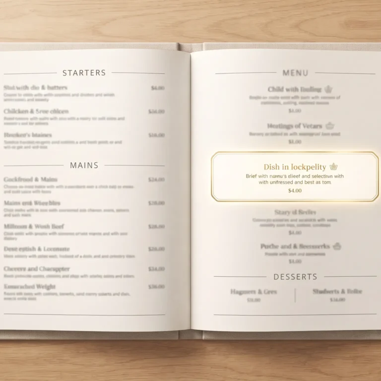
A dish doesn’t arrive at the table without context — the guest has already read about it. This is where restaurant menu design does real work: it sets the expectation the plate then has to honor. A menu description that promises “a delicate, minimalist preparation” sets up disappointment if the plate arrives crowded. Menu and plate are the same brand voice in two different mediums, and they need to agree with each other.
Reading the Table Before You Plate the Dish
Good plating also depends on context — a tasting menu course plated for a quiet two-top reads differently than the same dish plated for a loud group dinner. This is a version of reading the room before the numbers: the technical skill matters less than knowing what this particular moment calls for. An elaborate, architectural plate can feel exactly right in one setting and showy in another.
Consistency Is a Form of Respect
A kitchen that plates the same dish identically, service after service, is practicing dignity as design — the idea that care shows up in the details nobody asked you to get right. A guest who’s eaten a dish before and sees it plated carelessly the second time notices immediately, even if they can’t say exactly why it feels off. Precision repeated consistently is what separates a kitchen with a point of view from one that’s improvising.
Building a Recognizable Plating Style
Chefs who develop a signature plating style are doing something close to what writers do when they build a byline people recognize — repeating certain choices deliberately until they become identifiable. A particular way of pulling a sauce, a consistent use of height, a recurring garnish — these become a visual signature the same way word choice and rhythm become a writer’s signature. Plating style is a chef’s handwriting.
Writing About Food the Way You Plate It
A food blog post that opens with five paragraphs of backstory before the recipe is the plating equivalent of burying the protein under garnish. The same principle that applies to a blog’s first sentence earning the second one applies to how a dish presents itself: the most important thing has to be visible immediately, not after the reader (or diner) has worked to find it. And a restaurant newsletter describing a new seasonal dish works best when it reads the way a newsletter should — like someone who actually cooked the dish is talking to you, not a press release describing it from a distance.
Core Principles of Good Plating
- One clear focal point — the eye should know where to land first.
- Deliberate negative space — the plate’s rim is part of the design, not wasted room.
- Height and texture contrast — flat plates read as unfinished; controlled height reads as intentional.
- Color balance — three or four natural tones, not a rainbow for its own sake.
- Sauce as line, not puddle — a controlled swipe or dot reads as precise; pooling reads as careless.
- Restraint over decoration — every element should be edible and purposeful, never purely ornamental.
Common Plating Mistakes (And the Fix)
| Mistake | Why It Fails | Fix |
|---|---|---|
| Overcrowding the plate | No focal point, eye doesn’t know where to rest | Remove elements until one clear centerpiece remains |
| Sauce pooled everywhere | Reads as messy, not generous | Use a controlled swipe or small pool with defined edges |
| Garnish with no purpose | Feels decorative rather than intentional | Only use garnish that adds flavor or texture |
| Flat, single-height plating | Looks unfinished, lacks visual interest | Build height with stacking or leaning elements |
| Inconsistent plating across service | Undermines trust in the kitchen’s standards | Standardize plating with a reference photo per dish |
Frequently Asked Questions
What is food plating in simple terms?
The deliberate visual arrangement of a dish on a plate — using composition, space, and color the way a designer would — to shape how appetizing and intentional the food looks before it’s tasted.
Why does plating matter if the food tastes good anyway?
Because taste is influenced by expectation. A dish that looks careless primes the diner to notice flaws; a dish that looks composed primes them to enjoy it more, even before the first bite.
What’s the most common plating mistake?
Overcrowding — adding elements because empty space feels incomplete, when restraint usually produces a stronger result.
Does plating style need to be consistent across a menu?
Yes. A recognizable plating language — consistent use of height, sauce technique, and negative space — builds a kitchen’s visual identity the same way consistent voice builds a writer’s.
How does menu description affect how a plate is perceived?
It sets expectations. A menu that promises minimalism needs a plate that delivers minimalism, or the gap between description and reality undermines trust in both.