Business Card: A Whole Brand in Your Palm
A business card is roughly 3.5 by 2 inches. It carries no tagline, no homepage, no case studies, no testimonials. And yet, in the three seconds it takes someone to glance down and look back up, it has already told them whether you’re careful or careless, expensive or discount, established or guessing. Nothing in branding operates at a higher ratio of information communicated to space available.
This is why a business card deserves the same scrutiny as pricing or a pitch deck — it’s a small object doing a large amount of psychological work.
What Does a Business Card Actually Communicate?
A business card communicates trust, positioning, and attention to detail before a single word is read — through paper weight, typography, whitespace, and finish. People form a snap judgment about credibility from the feel of the card in their hand before they process the name or title printed on it, which is why design decisions on a card carry more weight per square inch than almost anywhere else in a brand.
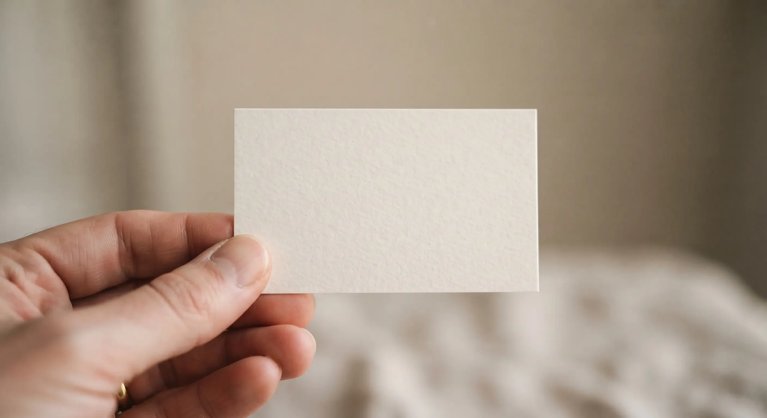
The Card Is Read Before It’s Read
The first thing a person registers isn’t the name or the logo — it’s the weight of the stock in their fingers and whether the edges feel cheap or considered. This happens below conscious awareness, the same way people instinctively read a room the moment they walk into it, picking up on tone before anyone speaks. A flimsy card undercuts a confident pitch before the conversation even starts. A substantial one builds credibility before you’ve said a word.
Whitespace Is a Decision, Not an Absence
The instinct with limited space is to fill it — more services, more credentials, more ways to reach you. But a crowded card reads as anxious, like it’s trying to prove something. The cards that read as expensive are usually the ones that say less, using generous whitespace to signal confidence rather than cramming in every possible detail.
This is the same restraint behind a well-timed silence in conversation — what you leave out often communicates more than what you include. A card with one typeface, one color, and three lines of text can feel more authoritative than one listing six credentials and two QR codes.
Typography Is the Card’s Tone of Voice
Since a business card has no tone of voice in the literal sense — no inflection, no pacing, no warmth in delivery — typography has to carry that emotional signal entirely on its own. A heavy serif reads formal and established. A thin, modern sans-serif reads startup and current. This is the same mechanism behind emojis functioning as tone of voice in text: when the medium strips away a human voice, the visual choices left behind have to work harder to say what a voice normally would.
What a Business Card Says “No” To
A good card is as much about what it refuses to include as what it contains. Every additional phone number, every secondary title, every social handle is a small negotiation about what matters enough to earn space. Deciding to leave something off is its own kind of discipline — close to the craft of saying no in conversation, where precision and restraint read as more confident than over-explaining.
The Handshake Happens Before the Card Does
In most exchanges, a business card is handed over in the same motion as a handshake — and the two are judged together. A firm handshake followed by a flimsy card creates dissonance; a hesitant handshake followed by a beautifully weighted card can recover some ground. This pairing is why trust built through a handshake and trust built through a physical object aren’t separate events — they’re the same three seconds of judgment, delivered through two different senses at once.
Dignity in a Few Square Inches
A business card is also a statement about how you regard the exchange itself — whether you treated this moment, and this person, as worth getting right. That’s the same underlying idea behind designing for dignity: small, easily overlooked details are often where respect either shows up or quietly fails to. A card that was clearly chosen with care tells the recipient the care extends to them, too.
The Card Is an Elevator Pitch With No Words
If a pitch deck has to move someone from skepticism to belief across ten slides, a business card has to attempt something similar in a single glance, with no slides at all. There’s no problem-solution arc, no traction slide — just a name, a role, and a handful of design choices that have to imply all of it. This is the most compressed persuasion exercise in business, and it rewards the same instinct for sequence and restraint that a good pitch deck does, just at a radically smaller scale.
Common Business Card Mistakes (And the Fix)
| Mistake | Why It Fails | Fix |
|---|---|---|
| Overcrowding with information | Reads as anxious, undermines authority | Keep to name, role, one contact method, and company |
| Cheap or flimsy stock | Undercuts credibility before anyone reads a word | Invest in paper weight and finish over cleverness |
| Mismatched typography and brand | Sends a confused signal about positioning | Match the typeface weight to the brand’s actual tone |
| Trendy gimmicks (odd shapes, excessive foil) | Can feel gimmicky rather than considered | Let restraint do the work instead of novelty |
| No thought given to the handoff moment | Breaks the physical trust-building moment | Treat the handover with the same care as the design |
Frequently Asked Questions
Why does a business card matter if most networking happens digitally now?
Because the few moments it’s used — in person, handed over deliberately — carry outsized weight precisely because they’re rare. A physical card in a mostly digital world signals intention.
What’s the single biggest design mistake on a business card?
Overcrowding. Trying to include every credential or contact method usually reads as less confident than a clean card with minimal information.
Does paper quality actually matter that much?
Yes. People register the weight and texture of a card before they consciously read it, and that tactile impression shapes how credible the rest of the interaction feels.
Should a business card match the website exactly?
It should match the brand’s tone, not necessarily every visual element. A card has far less space, so it often needs a simplified version of the same visual language.
Is digital replacing the business card entirely?
Not entirely — it’s become more of a deliberate, higher-stakes object precisely because it’s used less often, which raises the cost of getting it wrong.