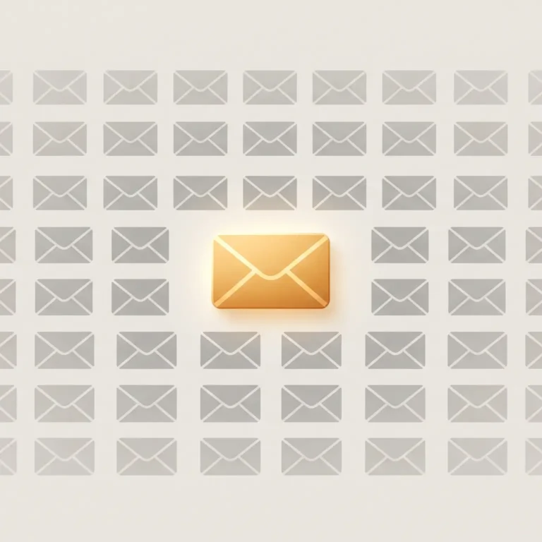
Notifications: The Etiquette of Interrupting Someone
Every notification is a small act of trespass.
It doesn’t ask permission. It arrives — on a lock screen, a badge, a buzz in a pocket — and in that instant, it makes a decision on your behalf: this matters more than whatever you were doing.
Most of the time, it’s wrong.
That is the uncomfortable truth at the center of notification design. A notification is not really a feature. It is an interruption dressed up as information, and like any interruption, it has etiquette — rules that separate a considerate tap on the shoulder from a rude shove.
Software rarely treats it that way. It treats attention as free, endless, and always available. It isn’t.
What Is Notification Etiquette?
Notification etiquette is the set of design principles that determine when, how, and whether an app should interrupt a user — based on the urgency of the information and the cost of breaking their attention.
Good notification etiquette asks a simple question before every alert: does this need to happen right now, on someone else’s terms, or can it wait until the user comes looking?
Most notifications fail this test. They’re sent because they can be sent, not because they should be.

Why Interruption Needs Rules
Human attention doesn’t reset instantly after an interruption. Research on task-switching consistently shows that regaining full focus after a disruption takes meaningful time — sometimes minutes, not seconds. Every notification, however small, has a cost that outlasts the half-second it takes to glance at it.
Software doesn’t feel that cost. Only the person on the other end does.
This is the same tension explored in the art of the 404 page — a moment where the product interrupts a user’s intention with bad news. A notification is the inverse: an interruption the user didn’t ask for at all. If a 404 page has to earn back trust after breaking a journey, a notification has to justify breaking one before it even happens.
A Short Taxonomy of Notifications
Not all interruptions are equal. Broadly, notifications fall into three tiers:
- Urgent and personal — a security alert, a message from a real person, a time-sensitive event. These deserve to interrupt.
- Useful but not urgent — a weekly summary, a price drop, a reminder. These deserve to wait.
- Manufactured urgency — streaks, re-engagement pings, “someone liked your post.” These deserve to be quiet by default.
Most apps blur these three into one undifferentiated buzz. That’s the etiquette failure. A well-mannered product treats its notification channel the way a well-mannered person treats someone else’s time: sparingly, and only when it’s actually earned.
The Psychology of Being Interrupted
An interruption is judged less by what it says and more by how it arrives. The same message — “your order shipped” — feels helpful as a quiet badge and intrusive as a full-screen takeover with sound.
This is where notification design overlaps with something Picasso Art writes about often: the emotional register of small interface decisions. A notification isn’t just information; it’s a moment of feel, the same way app design lives at the intersection of function and feeling. A badge count says “whenever you’re ready.” A push alert with sound says “now.” Choosing the wrong register is the digital equivalent of shouting across a quiet room to say something that could have been a note.
Timing matters just as much as tone. A notification that respects the rhythm of an interface waits for a natural pause — after a task is finished, not in the middle of one. Interrupting mid-flow is the notification equivalent of a bad cut in film editing: technically fine, emotionally jarring.
What Good Notification Etiquette Looks Like
| Rude Interruption | Respectful Notification |
|---|---|
| Interrupts mid-task, regardless of urgency | Waits for a natural pause, unless truly urgent |
| Uses sound/vibration for low-stakes updates | Reserves sound for genuinely time-sensitive events |
| Bundles unrelated updates into one alert | Groups related information, sent together |
| Repeats the same nudge to force a reaction | Sends once, respects the non-response |
| Treats every user the same, always-on | Adapts to context — time of day, device state, do-not-disturb |
| Optimizes for opens, not for value | Optimizes for whether the interruption was worth it |
That last row is the real dividing line. A notification designed to be opened is optimizing for the sender. A notification designed to be worth opening is optimizing for the person receiving it.
Context Is the Missing Ingredient
Most notification systems are context-blind. They fire the same way at 9 a.m. and 2 a.m., on a phone that’s actively in use and one that’s been asleep for hours.
Consider how dark mode design respects the user’s environment — dimming interfaces because the room, the time, and the eyes asking for it have changed. Notification etiquette asks for the same environmental awareness. A well-mannered system asks: Is this a good time? Has this person already seen enough today? Is this the right device to interrupt on?
Even a loading state carries a version of this courtesy — good loading-screen design tries to make an unavoidable wait feel considered rather than careless. A notification is the same problem in reverse: instead of asking someone to wait, it’s asking them to stop. Both moments deserve the same respect for the user’s time.
A Simple Framework for Designing Respectful Notifications
- Ask if it needs to interrupt at all. Could this live quietly in an inbox or badge instead of pushing to the lock screen?
- Match urgency to intensity. Sound and vibration are reserved for things that are actually urgent — not things you want to feel urgent.
- Batch, don’t scatter. Group related updates into a single, well-timed message instead of five small interruptions.
- Respect silence. If a person doesn’t act on a notification, that’s an answer — not a reason to send it again louder.
- Let people set the terms. Granular controls (by type, by time, by channel) are the difference between a guest and an intruder.
- Design for the exit, not just the entry. A notification should make it easy to dismiss, snooze, or unsubscribe — the same way a good interface never traps someone.
The Most Common Mistake: Confusing Engagement With Value
Many products measure notification success by open rate and reaction time. But those numbers reward interruption, not usefulness. A notification that gets opened because it’s alarming isn’t good design — it’s manipulation wearing a badge icon.
The healthier metric is quieter and harder to game: would the user have wanted to know this, unprompted, at this exact moment? If the honest answer is no, the notification shouldn’t exist — no matter what it does for engagement dashboards.
FAQ: Notification Etiquette
What is notification etiquette in simple terms?
It’s the practice of designing alerts based on how urgent and valuable they actually are to the recipient — not how useful they are to the sender.
Why do notifications feel rude even when the information is useful?
Because tone and timing matter more than content. A useful update delivered with a jarring sound at the wrong moment still feels like an intrusion.
Should every notification make a sound?
No. Sound and vibration should be reserved for genuinely time-sensitive alerts — a badge or silent banner is enough for everything else.
What’s the biggest sign of bad notification design?
Repetition. Sending the same nudge again after being ignored treats silence as a technical failure instead of a clear answer.
How does context affect notification etiquette?
Time of day, device state, and recent activity should all influence whether and how a notification arrives — a system with no context awareness is a system with no manners.
Is reducing notifications bad for engagement?
Short-term metrics may dip, but trust compounds. Users who feel respected by a product’s notifications are more likely to act on the ones that do arrive.
The Real Standard
The best measure of notification etiquette isn’t a design system — it’s a simple human test: would you interrupt a friend this way, for this reason, at this moment?
If the honest answer is no, the notification shouldn’t exist as it is. If the answer is yes, it deserves to be sent with the same care as everything else in the product — the loading state, the error page, the dark mode, the rhythm of the whole experience.
A notification is a small moment. But like every small moment in software, it either earns trust or spends it.